Home / Tips and Trends / Design Theory
As per Wikipedia, Design is the planning that lays the basis for the making of every object or system. It pertains both to applied arts and engineering. The final product can be anything from clothing to graphical user interfaces to skyscrapers.
The person designing is called a designer, which is also a term used for people who work professionally in one of the various design areas, usually also specifying which area is being dealt with (such as a fashion designer, concept designer or web designer). Designing often requires a designer to consider the aesthetic, functional, and many other aspects of an object or a process, which usually requires considerable research, thought, modeling, interactive adjustment, and re-design. Serious study of design demands increased focus on the design process.
For more info visit www.digitalweb.com Design elements are the basic units of a visual image. These elements include:
A point is an element that has position, but no extension. It is a single mark in space with a precise, but limited, location. Line or form is a natural result of multiple points in space.

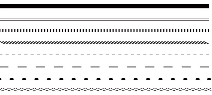
A line is an element characterized by length and direction. Lines create contours and form, and are often used to convey a specific kind of feeling or point to an important feature in a design. Lines are also used to create perspective, and dominant directional lines are often adopted to create a sense of continuance in a composition. In addition, lines that are grouped together often create a sense of value, density or texture.
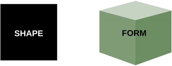
The simplest definition of shape is a closed contour, an element defined by its perimeter. The three basic shapes are: circle, rectangle (square) and triangle. Form is the shape and structure of a dimensional element within a given composition. Form can be both two-dimensional and three-dimensional and can be realistic, abstract or somewhere in between. Form is derived from the combination of point, line and shape.
Space is the area provided for a particular purpose. It may have two dimensions (length and width), such as a floor, or it may have three dimensions (length, width, and height). Space includes the background, foreground and middle ground. Space refers to the distances or areas around, between or within components of a piece.
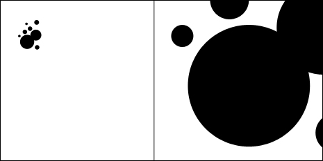
Texture is used to create surface appearance, and relates to the physical make-up of a given form. Texture often refers to the material that something is made of, and can be created using any of the elements previously discussed. Texture is both a visual and a tactile phenomenon.
Balance refers to a sense that dominant focal points don’t give a feeling of being pulled too much to any specific part of the artwork. Balance can be achieved by the location of objects, volume or sizes of objects, and by color. Balancing lighter colors with darker colors, balance bold colors with light neutral colors.

There are many different kinds of color systems, and many different theories on color. We will discuss here using a color wheel for illustration purposes.
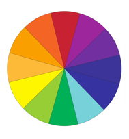
A colour circle, based on red, yellow and blue, is traditional in the field of art. (For more basics on colour theory, click here.)
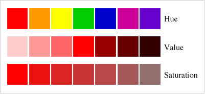
Colour harmonies refer to the relationships between colours. It gives an idea of blending colours to form a palette. Color harmony means pleasing, effective, congruent and balanced combination of two or more colors or shades. It does not imply a random mixing of colors but a purpose¬ful selection of a number of colors to get the desired effect. It is achieved by combining related or contrasting colors.
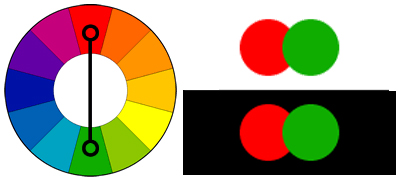
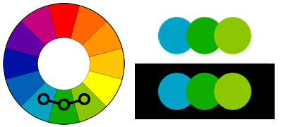
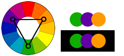
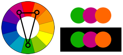
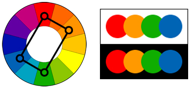
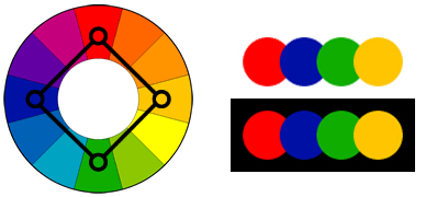
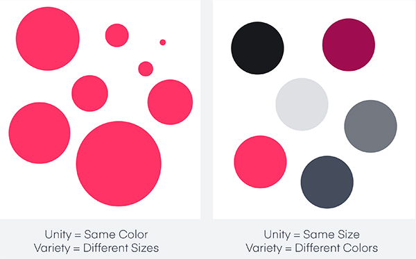
Unity refers to a sense that everything in a piece of work belongs there, and makes a whole piece. It is achieved by the use of balance, repetition and/or design harmony.
Variety is the use of dissimilar elements, which creates interest and uniqueness. Variety like a painting or some reflective wood panels added on a plain wall may be used to reduce monotony. Helps infuse color to a house decor to attempt to increase design beauty.
Value is an element of art that refers to the relationship between light and dark on a surface or object and also helps with Form. It gives objects depth and perception. Value is also referred to as tone.
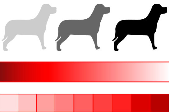
Pattern is the repetition of shape or form. It can also reflect the underlying structure of a design by organizing the surfaces or objects in the composition. There are many different kinds of patterns

The principles of design govern the relationships of the elements used and organize the composition as a whole. Successful design incorporates the use of the principles and elements to serve the designer’s purpose and visual goals. There are no rules for their use. The designer’s purpose and intent drives the decisions made to achieve harmony between the elements. The principles of design consist of:
Harmony is achieved through the sensitive balance of variety and unity. Color harmony may be achieved using complementary or analogous colors. Harmony in design is similarity of components or objects looking like these belong together. Harmony may be visually pleasing and it is when some of the objects like drapes and couches share a common trait. A common trait between objects could be: color(s), shape(s), texture, pattern(s), material, theme, style, size, or functionality.

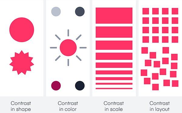
Refers to differences in two different sections of the design or between two different sets of designs. Contrast is the occurrence of differing elements, such as color, value, size, etc. It can also be used to show emphasis in any part of the design.
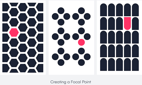
It is an area within the design that is more important to be noticed when compared to other places of the design. For example, a design might be having white parallel lines going up and down. Center of the design consists of a circle. This circle would be a part on the design that is emphasized.
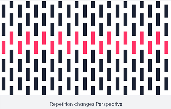
The recurrence of elements colors, lines, shapes, values, etc. within a piece of art is Repitition. Any element that occurs is generally echoed, often with some variation to maintain interest.
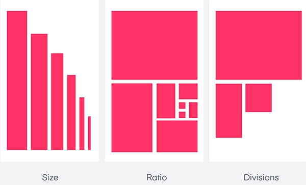
Proportion involves the relationship of size between objects. Proportion is also relative sizes of surface areas of different colors. Proportion also depends on functionality of object.
Proximity is the placing of similar objects closer together physically, and unlike objects further apart. This aids in creating unity. For example, different furniture styles with different colors compressed in a small bedroom does not look as nice as the same furniture placed further apart in a very large living room.

A design must have good functionality. Proper functionality is simply the best possible design and best possible location of this design that the user(s) requires. Good functionality allows the user to utilize the design / product in the best possible way. Great functionality and best possible materials for the function usually also increase visual appeal.