Home / Tips and Trends / Color Theory
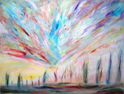
Colours are the essence of life and the most beautiful gift of nature. A world without colours is un-imaginable. It can be thought of as a body without soul, a heart without beats, a river without water, a lover without emotions! In the field of design, colour is the most inevitable component. Regardless of the product, colours add meaning to every design. Even a simple line comes to life with colours.
Colour is the first thing we register when we are assessing anything and we make an immediate response to it before anything else. It is one of the most effective tools that can be used to make an impact, and this applies to what we wear or use as accessories. Psychologists have suggested that colour impression can account for 60% of the acceptance or rejection of any product or service.
Colours have a demonstrable psychological effect. So, our automatic reaction to colours is very strong. The sight of red means warning and white means simplicity and respective of title. Military uniforms are intentionally coloured to give statement and impose authority. Colours are used in many ways to assert recognition because they are fairly easy to read and understand.
We need to practice by understanding their association with seasonable colours (spring, summer, winter, and fall). They can give a set of guidelines for flattering effect of our products. We’ll also be able to forecast colours for the next season.
For more info visit www.smashingmagazine.com
Although colours can be categorised in endless ways but in design industry the most common scheme used is of warm and cool colours.
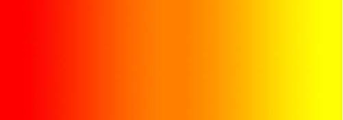
Warm colours include red, orange, and yellow, and variations of those three colours. These are the colours of fire, heat, of fall leaves (autumn), and of sunsets and sunrises, and are generally energizing, passionate, and positive.
Red and yellow are both primary colours, with orange falling in the middle, which means warm colours are all truly warm and aren’t created by combining a warm colour with a cool colour. Use warm colours in your designs to reflect passion, happiness, enthusiasm, and energy.
In Fall & winter seasons, people like to see & use `Warm’ colours & their variations. Colour palletes for these seasons are designed accordingly.

Cool colours include green, blue, and purple, are often more subdued than warm colours. They are the colours of night, of water, of nature, and are usually calming, relaxing, and somewhat reserved. They remind of all cool things in nature.
Blue is the only primary colour within the cool spectrum, which means the other colours are created by combining blue with a warm colour (yellow for green and red for purple). Greens take on some of the attributes of yellow and purple takes on some of the attributes of red. Using cool colours in designs gives a sense of calm or coolness.
In spring & summer seasons, people like to see & use `Cool’ colours & their variations. Colour palettes for these seasons are designed accordingly.
For more info visit http://www.colormatters.com/
Colour theory encompasses a multitude of definitions, concepts and design applications. All the information would fill several encyclopaedias. As an introduction, here are a few basic concepts.
A colour circle, based on red, yellow and blue, is traditional in the field of art.
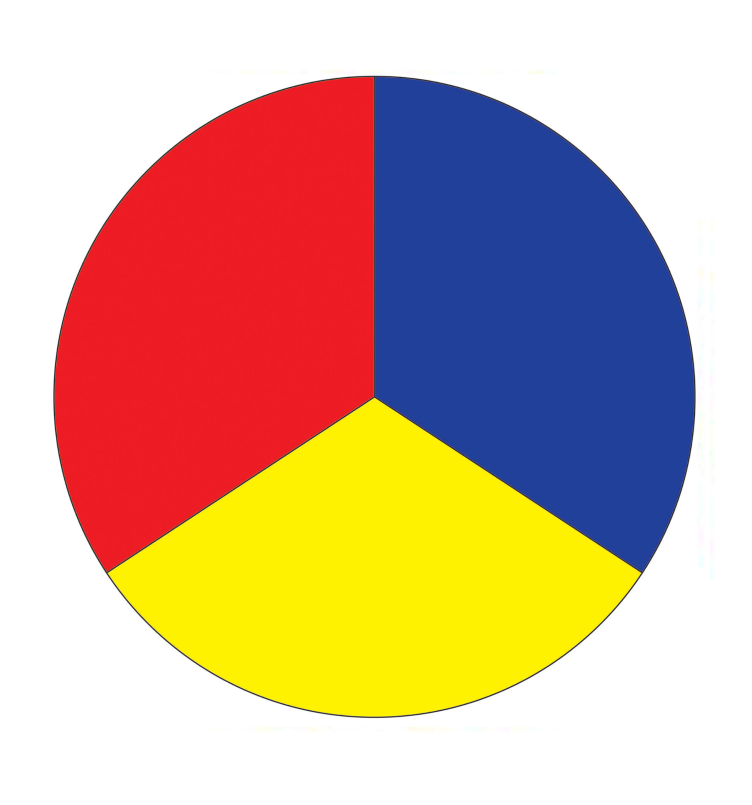
Red, yellow and blue
These are the colours formed by mixing the primary colours.
Green, orange and purple
These are the colours formed by mixing a primary and a secondary colour. That’s why the hue is a two word name, such as blue-green, red-violet, and yellow-orange.
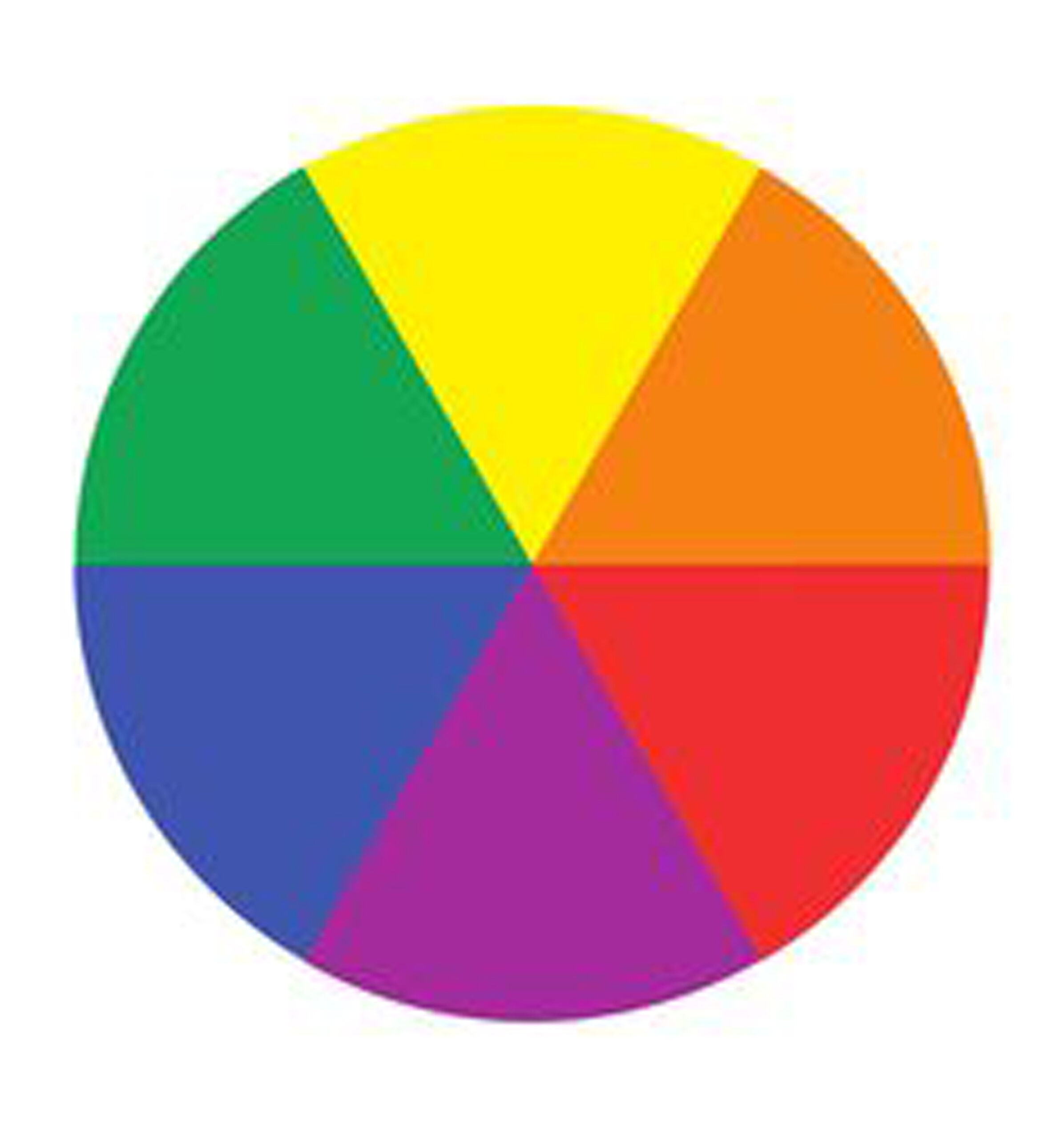
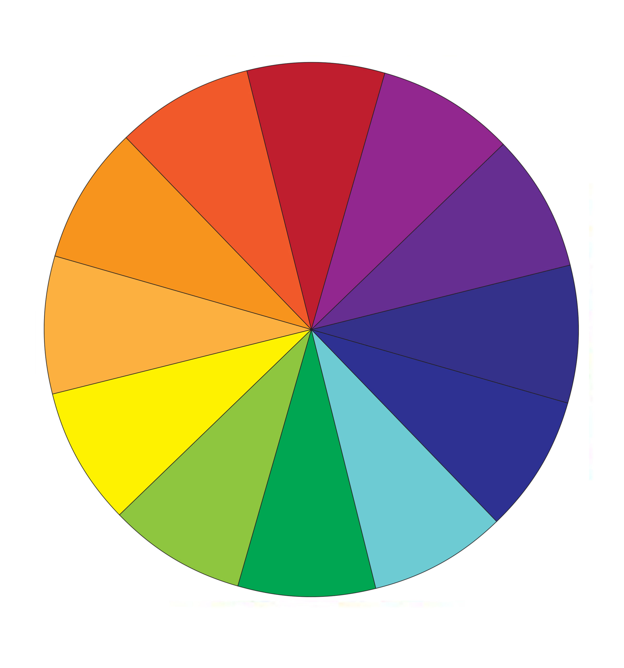
Yellow-orange, red-orange, red-purple, blue-purple, blue-green and yellow-green.
In traditional colour theory, these are the 3 pigment colours that cannot be formed by any combination of other colours. All other colours are derived from these 3 colours.
Harmony can be defined as a pleasing arrangement of parts, whether it be music, poetry, colour, or even an ice cream sundae.
In visual experiences, harmony is something that is pleasing to the eye. It engages the viewer and it creates an inner sense of order, a balance in the visual experience. When something is not harmonious, it’s either boring or chaotic. At one extreme is a visual experience that is so bland that the viewer is not engaged. The human brain will reject under-stimulating information. At the other extreme is a visual experience that is so overdone, so chaotic that the viewer can’t stand to look at it. The human brain rejects what it can not organize, what it can not understand. The visual task requires that we present a logical structure. Colour harmony delivers visual interest and a sense of order.
In summary, extreme unity leads to under-stimulation, extreme complexity leads to over-stimulation. Harmony is a dynamic equilibrium.
There are many theories for harmony. The following illustrations and descriptions present some basic formulae.
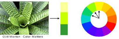
Analogous colours are any three colours which are side by side on a 12 part colour wheel, such as yellow-green, yellow, and yellow-orange. Usually one of the three colours predominates.
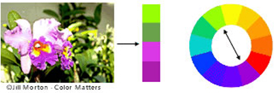
Complementary colours are any two colours which are directly opposite each other, such as red and green and red-purple and yellow-green. In the illustration above, there are several variations of yellow-green in the leaves and several variations of red-purple in the orchid. These opposing colours create maximum contrast and
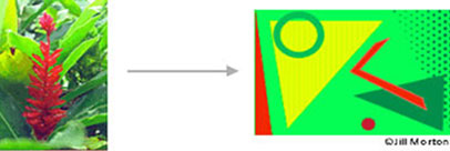
Nature provides a perfect departure point for colour harmony. In the illustration above, red yellow and green create a harmonious design, regardless of whether this combination fits into a technical formula for colour harmony.
How colour behaves in relation to other colours and shapes is a complex area of colour theory. Compare the contrast effects of different colour backgrounds for the same red square.

© Colour Voodoo Publications
Red appears more brilliant against a black background and somewhat duller against the white background. In contrast with orange, the red appears lifeless; in contrast with blue-green, it exhibits brilliance. Notice that the red square appears larger on black than on other background colours.

© Colour Voodoo Publications
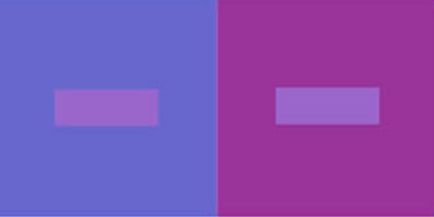
If your computer has sufficient colour stability and gamma correction you will see that the small purple rectangle on the left appears to have a red-purple tinge when compared to the small purple rectangle on the right. They are both the same colour as seen in the illustration below. This demonstrates how three colours can be perceived as four colours.
Observing the effects colours have on each other is the starting point for understanding the relativity of colour. The relationship of values, saturations and the warmth or coolness of respective hues can cause noticeable differences in our perception of colour.
Colour theory is a science in itself. Studying how colours affect different people, either individually or as a group, is something some people build their careers on. And there’s a lot to it. Something as simple as changing the exact hue or saturation of a colour can evoke a completely different feeling. Cultural differences mean that something that’s happy and uplifting in one country can be depressing in another.
Combining is all about creating a mix of colours that create complement each other. Here are some simple examples of colour combinations and the look they can create:


When these colours are combined they can create a bright, happy combination.


When these colours are combined they look strong and serious and create a great formal look.

The above are just simple examples but the possibilities are endless
The above is a short introduction on how to use colour to your advantage. Using colours correctly can transform your products for the better and our aim is to guide you how.