Fashion is always changing, slightly elusive, and extremely seductive. It has the power to transform an image and make a social statement. A product designed according to the latest fashion may sell as hot cake.
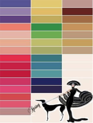
Spring generally refers to the six-month period from January to June, It is the season of fresh, clean, and tender new leaves & flowers.
Changes between the red of the winter and the red of the summer are the value and the chroma.
Spring has medium and light colors, and some vivid colors, and it is the season, which looks best with corals and salmons.
A typical Spring Colour Chart
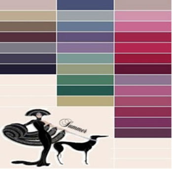
Summer is defined by soft and Cool colors including green, blue, and purple. They are the colors of night, of water, of nature, and are usually calming, relaxing, and somewhat reserved.
Some colors are missing from some of the palettes for example; black is missing from the summer palette, because it’s not a flattering color for summers close to the face.
Pastels are lovely for summer.
A typical Summer Colour Chart
Blue is the only primary colour within the cool spectrum, which means the other colours are created by combining blue with a warm colour (yellow for green and red for purple). Greens take on some of the attributes of yellow and purple takes on some of the attributes of red. Using cool colours in designs gives a sense of calm or professionalism, colours and all the pastels; its dark colours are more muted than those of Winter.
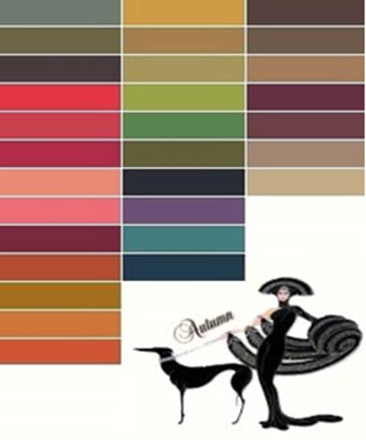
Strong colored autumns look wonderful in black. Perfect for autumns also are camels or most shades of the browns.
This palette has rich, warm, golden colours, light and dark in tones both muted and vivid.
There are some colours – about a dozen – which can be worn by all seasons.
A typical Autumn/Fall Colour Chart

Winters are characterised by warm colours including red, orange, and yellow, and variations of those three colours. These are the colours of fire, of fall leaves, and of sunsets and sunrises, and are generally energizing, passionate, and positive. Red and yellow are both primary colours, with orange falling in the middle, which means warm colours are all truly warm and aren’t created by combining a warm colour with a cool colour. Use warm colours in your designs to reflect passion, happiness, enthusiasm, and energy. Winter/holiday clothing usually arrives in stores from late October to early November and remains there through the rest of the calendar year. Regardless of fashion trends, one can usually expect to see velvets, embellished clothing, heavy outerwear and party dresses in stores at this time.
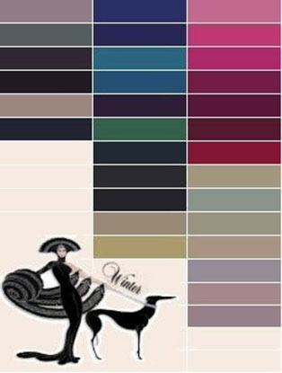
The winter palette has the range of all dark, vivid, and bright colours.
It also has all those very light icy colours. It holds all the primaries, being white, black, pure red, and navy. Winters do not wear most oranges well.
Light-medium browns and some camel are not the best choice for Winters.
A typical Winter Colour Chart

“Seasonless dressing” is a recent fashion movement, describing a trend of wearing the same fashions year-round. People are spending increased amounts of time in climate-controlled environments. Air-conditioned and heated cars and work spaces equal less time in natural temperatures, and thus, less demand for heavy winter clothing. This means that fall and winter clothing may begin to appear and feel less autumnal–designers will show lighter fabrics and lighter colours. Summer clothing could become acceptable as year-round clothing–for example, summer dresses can be adapted for fall by layering turtlenecks and tights underneath.